Thursday, December 3, 2009

FINAL A2 PRODUCTS

THE POSTER:

THE MAGAZINE:

THE TRAILER:

EVALUATION

In what ways does your media product use, develop or challenge forms and conventions of real media products?

My main product and ancillary texts use and develop forms and conventions of real media products, they do this in various ways.

Firstly I shall speak about how my main product used and developed forms conventions of real media products. My main product was the film trailer/teaser trailer, there were various things that I would have to think about when filming for the production process and editing process.

Some of the main elements that film teaser trailer may include are a voice-overs, sub-titlings (reviews, interviews and quaotes about the film),opening titles showing main company name and maybe the film company name, ending title saying the title for the film and a title saying the date of release (quite alot of the time these titles can be done together).

To use the forms and conventions of a real media product I had to include these elements within my trailer. I used a voice-over saying about a tape being sent to you, this also uses direct audience address, with the voice-over I added an effect to the recording of the voice to make it have a slight echo and for it to be a deeper pictched voice, this made it sound more unique and made it seem slightly more disturbing for the audience.

I used sub-titlings saying things that could have been quoated about the film, this draws the audience in to reading what has been said about the film, to see if it would there type of film to go and watch. I used three sub-titlings in my trailer with gaps of footage/video in beetween to keep the audiences attention whilsit still giving them information.

I also used both an opening company title and an opening filming company title, the opening company title was for 'Universal Studios' and the filming company title I made using adobe after effects myself 'MJM productions'. This gave the audinece a know of companies that could have been used for the film and it uses more of the forms and conventions that would be used in a real media product. This was the same with the ending titles, I used the idea of putting the film date realease with the film title name on one title clip, I made the title using adobe after effects.

It also sticks to the forms and conventions with using a plot for the trailer, it shows a small bit of act one and gives the impression to the audience that the characters have just arrived back from a holiday or some where off island as the opening shot is a shot that I filmed out of a window of a plane and the next shot is both of them walking through a door with suitcases.

The film trailer shows parts of the middle of the film and then leaves it on a bit of a cliff hanger, making the audience wonder what has just happened etc and making them want to see the film when it comes out. It also uses forms and conventions of a teaser trailer using a soundtrack in the film, the sound track was made by me using the program Garageband. Using a soundtrack brings together all the clips and gives it a better background noise, if there is any silence etc. It also makes it more interesting to watch.

The ancillary texts are both in a print type format of media, one being a poster and the other being a film magazine front cover both advertising the film from in the teaser trailer. The they both use the forms and conventions of a real media product.

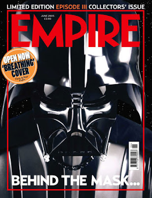
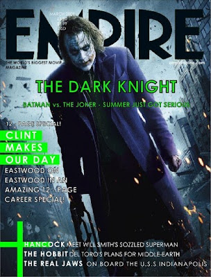
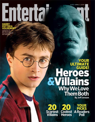
With a poster you usually have, one main image, the main film title, a date release line and the actors names section and extra information section at the bottom of the page. In my poster to stick to the forms and conventions I used each of these things. The main image- one of the film character cover in blood, the main film title- 'Bloodshed', the date release line-In Theatres May 26, Actors names-Carl jenkins, William Robinson, Dom Norman, extra information-directors names, company names etc.

The film magazine front cover also sticks to the forms and conventions of a real media product, It uses a main image-the face with the drill, A masterhead (saying the magazines name)-Filmdays, advertisements-free posters etc, date line-june 2009, a barcode, coverlines-things that are covered in the magazine etc.

I feel as If my products used and developed forms and conventions for real media products very well and that from the feedback that I recieved the final products most have done it well as they were all liked.

How effective is the combination of your main product and ancillary texts?

The combination of my main product and ancillary texts work effectivally as they link with pictures, ideas and genre. The poster uses an image of one of the films characters covered in blood, this links back to the film and reminds the audience about the film, making them want to go and see it.

It shows genre with a graphic picture, the blood links in with the film genre being a horror/thriller film as within that genre there tends to be violence, action, blood etc.

I used a photo of the drill from in the film to use on my magazine front cover. The drill shows a link to the film with mise-en-scene as it was a prop used in the film.

Each of my products link to each other with mise-en-scene, genre, overall feel to the product and characters used within the product as footage or an image.
I feel as if the combination of the main products with the ancillary texts work really well. I also was told by a few people when getting feedback that they could really see the link and all the products worked really well together.

I can tell that the products work well together and show good links as the audience can tell that they are all for the same film. This would be so that the poster would show people to look forward to the film and they would then want to see the trailer, they'd be able to find and see the trailer as they'd be able to look for charcter links or title links etc. Also after that or before they may see it on the magazine and want to read about it.

What have you learned from your audience feedback?
To get feedback I did anything I could, I tried sending my trailer to a few proper film companies like Touchstone and Universal Studios Pictures and other well known film companies but I didn't receive any replies in time.

I then showed all three products to various teachers around my college to see what they thought about each of them. One teacher said they liked the camera shots as it gave them a different view to see it from, they also said that the transitions were not noticeably and it was a good use of continuity editing at the start of the trailer. Another teacher said it looked really well done and some what professional.

The comments I received about the magazine and the poster were amazing, one teacher said that they thought I was just showing them a random magazine front cover, they didn't believe I made it, they said it look to professional. Other comments were similar and mostly all my feedback was positive, except for the odd person saying it was gruesome but it was meant to be so these comments weren't that bad.

My media teacher told me that the voice-over for my film trailer was to quite and that the opening shot wasn't interesting enough. These were both later changed and I added a new shot which I filmed whilst taking a trip out of a plane window. My media teacher also told me that the there was to much black in the background to the poster and that the image needed to be bigger to change this and make it look better, this was later changed in the production process. My media teacher really liked my film magazine front cover and only had positive comments.

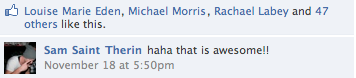
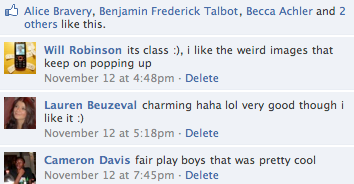
Other feedback I received about my film was recorded on a website called 'facebook' after uploading my work on to the website, I received comments and people saying that they liked it etc. Below Are a few of many comments and also shows that people liked the film.


If I were to do this all again I would make the genre different, something not as dark, I would do a comedy genre as it would be a nice change. I would also use a bigger range of camera shots, and use more exciting locations to film my trailer. From feedback I have learnt a few things that helped and made my work better after changing things after hearing Ideas. Overall from feedback I have learnt that hard work really does pay off.

How did you use media technologies in the construction and research, planning and evaluation stages?

Throughout doing my coursework I have used various forms of media technologies in the construction of research, planning and with the evaluation stages. This ranges from using a voice recorder to using a video camera to using Adobe After effects and much more.

For the research process I had to use the internet to find out about other films, find videos and download images of perfessionally made posters and film magazine front covers. I used various search engines such as 'Google' and 'Dogpile'. This was helpful as I was able to find pretty much anything I wanted and find out anything I needed to.

When constructing during the planning process I used a camera to take photos of my storyboard, I also used a photocopier machine to scan the storyboards into the computer. I then up loaded these on to the blog, also I cropped these images and added them to a video on the program iMovie and made my animatic for the film, this was to show what I wanted my final film to be laid out like. I also used the program Garageband to make some music to add to the background of my animatic to show genre.

Also in the constructing process for planning for my film magazine and for my poster I uploaded images i had drawn using the scanner to show what I'd like my layout and look for my poster and film magazine front cover to look like.

When producing the film I used many different forms of media technologies to make my products, I used the program on an Apple Mac called iMovie to edit and make my film, cutting the clips, adding titles and adding transitions etc.

Also I used the program adobe after effects to make my titles for the film. This was interesting as I had never done this before but it turned out to look good and work well within my film.

To make both my poster and film magazine front cover I used the program Adobe Photoshop to edit photos, add texts and to make my final product. It worked well and came together well.

When evaluating my work I used photoshop and Microsoft to make a comparisons sheets for both my magazine front cover and poster. I also used iMovie to make evolution, directors chat and other videos, adding music in the background and recording a voice over.

In the research, planning and evaluation stages I used various forms of media technologies to make a range of things, I enjoyed making my work and would not change anything that I did with using programs to make my products.

Evaluation Video


Sorry for the bad quality video, could not upload any higher quality in video

PHOTOS USED BEFORE THEY WERE EDITED

Please click the images to enlarge them to see it better and be able to see the difference and how much they have changed.


These photos were taken by me, they all were used in either my poster or film magazine front cover. This is what they looked like before they were fully edited etc.

Talk on the film/Directors Chat/How It came together


The videos above speak about the film and how it all came together. It speaks about shots, ideas, camera movements and inspiration.

Pre-Finished Video Film


This video simply shows what my film was like near to being finished, after feedback from random people, teachers and friends and family I decided to remove the text as it was tacky and made the trailer to long, it also didn't fit in with the rest of the style of the film. I also changed the start part with the Touchstone Title opening to the Universal Studios title opening as Touchstone are know for less explicit films with less violence, whereas Universal Studios has produced various more explicit films.

Film Magazine Cover Comparison

This image shows I have followed the codes and conventions for a Film Magazine front cover. It compares both my own cover to a professionally made cover and shows how it was layed out in comparison.

They both use a colour scheme, mine uses a red coloured colour scheme and the other magazine uses a blue coloured colour scheme. Like with my poster it uses semiotics and links colour ideas, for example red could represent blood,guts,evil, the devil etc.

The picture directly addresses the audience as the image is looking straight forward, so they feel as if they are being looked back at. It may also creep the person out as the picture is slightly distrubing.

My poster also, like the other poster uses advertisments and caputures the audiences attention making them want to find out what else is in the magazine etc.

Please click image above to enlarge.

Poster Comparison

This image shows I have followed the codes and conventions for a Film Poster. It compares both my own poster to a professionally made poster and shows how it was layed out in comparison.

The poster I made uses direct audience address as the image is looking straight forwards, this is good as the audience are drawn in to look at the poster. The picture is almost like one of those pictures which would creep you out as it feels like you are being watched. It works well as the strange feeling which the audience get from looking at the poster gives them the feeling they could get from watching the actually film.


The colours used in the picture have been done using thoughts of semiotics and how colours can represent something, having the black background gives it a dark, mysterious, evil, gloomy feeling these all link with the genre of film. The red on the poster uses semiotics to link with evil, blood, devil, guts and other nasty things but could also link off to show things to do with love.

The text and fonts look good as they linjk with the colour scheme and the overall look of the poster. They are stand out on the black round and tell the audinece any needed information they need to know.

Please click on the image above to enlarge.

Final Magazine Front Cover

Please click on the image below to enlarge the size and see in full detail.


The image above was made using photoshop. I followed the codes and conventions of a film magazine front cover to make it. I used various different layers to build up the final product. I also used my own photos which I took with my Casio camera and edited it all myself. Everything on this piece of work was made by me. The only feedback which I got was that the image in the background was to dark, this was easily changed by editing the brightness levels of the image on photoshop. Other feedback from freinds and random people was things such as 'it looks like a real magazine, well done and fair play', 'thats great, it looks perfessional', 'its better than some perfessional magazines' and other nice comments of the sort.

The FREE POSTER part on my mag front cover

I made these images using my own photos that I took using my camera, I then edited them and used them in the bottom corner of my film magazine front cover as little advertisements, please click image to enlarge.


Tuesday, November 17, 2009

HOW I MADE THE MAGAZINE

To make my film magazine front cover I used my own photos which I had taken using a Casio digital camera, I then uploaded them on to an Apple Mac Computer and edited them using Photoshop, below is a video to explain this process and how I did it. Please watch the full video to understand my work process.

Film Mag Plan

Both of these images are planned drawing of what the layout shall look like for my film magazine front cover. I shall take my own photos and make my own texts using a camera and an editing program on an Apple Mac Computer called Photoshop. This shall be made in the same way as I made my film poster.


Film Magazine Front Cover Target Audience

Gender-male/female-
My film magazine front cover will be made for both males and females to view. The film magazine front cover shall stick to the codes and conventions of a typical magazine front cover. The film magazine front cover shall not be aimed directly at either sex. Although men would most likely prefer to look at it as it most likely to have a gory and very graphic picture some where on the cover as the film it shall be advertising is my horror trailer film ‘Bloodshed’. Even though some women also find that pictures are interesting to look at as they don’t see that sort of thing every day, even it doesn’t look very nice.

The genre for my film magazine front cover shall be Thriller/Horror like with the genre for the film teaser trailer and film poster. The film magazine cover may include violence and be rather graphic with the pictures. It shall have one main big masterhead (magazine title, a date of the issue line, a main cover line (main topic with in the magazine to grab attention of people), model credit (use of a famous person or character), a main image, cover lines (other things that the magazine speaks about).

I would like my audience to look at the film magazine and think it looks interesting and would make them want to buy it if it were a real product in a shop. My Magazine front cover shall stick to the codes and conventions of the typical film magazine front cover.


Age-the age group e.g. elderly, teenagers etc-
My film magazine front cover will be aimed towards older children/adults aged 15-18 or older. This is because it may include a mild use of violence or explicit materials within the magazine and may use a graphic picture on the front cover which younger children would not like.

The magazine would be put in shops and sometimes in cinemas and in places where young adults tend to look for there magazines, so this would most likely be with other magazine of the same type such as ‘Empire’, ‘NME’, ‘FHM’ etc. This would give the magazine a good advertisement for the audience, as they would know where to look for it.

Class-ABC1, C2DE, lower, higher etc-

I would like my film magazine to be for any class, so anyone who just generally like films and knowing more about them.


Monday, November 16, 2009

Research Film Mag Front Cover- Transformers 2

This film magazine front cover also sticks to the codes and conventions of the typical magazine front cover, using one main big masterhead (magazine title) saying Empire, a date of the issue line, a main cover line (main topic with in the magazine to grab attention of people), model credit (use of a famous person or character), a main image, cover lines (other things that the magazine speaks about).

This magazine front cover has a lot going on, it looks really interesting and looks as if it is jam packed with fun and appealing information.

It has one main picture and three separate other pictures of interest to its audience. Under the other three pictures it has titles saying what is shown in the picture, this makes them want to look inside the magazine.

The text is appealing to the audience as it says things like ‘MUST-SEE’, it then makes people want people want to buy the magazine to see what they ‘MUST-SEE’ etc.

The cover lines are at the bottom of the magazine front cover this is good as after they have read down from the top of the front cover page, it just tells them other extra stuff; just encase its something they’d like.

It also has the cost of the magazine written next to the date-line; this is good as people are able to see if it is a new or old issue and how much it shall cost them to buy etc.

From looking at this magazine front cover I have thought about using extra separate pictures as well as the main picture, I have also thought about ways to make my magazine front cover look more jam packed and interesting. I have also thought about where the date-line and cost should be written etc.


Research Mag Front Cover- Star Wars

This film magazine front cover also sticks to the codes and conventions of the typical magazine front cover, using one main big masterhead (magazine title) saying Empire, a date of the issue line, a main cover line (main topic with in the magazine to grab attention of people), model credit (use of a famous person or character), a main image, cover lines (other things that the magazine speaks about).

The first thing that captures the attention of the audience/ the person viewing the magazine is the writing at the top of the page saying ‘Limited Edition…’ this makes it seem more important and would make people want it as it is limited etc.

The white writing/font at the top of the page looks good as it stands out against the black background of the helmet of the main picture, but the white writing at the bottom of the film magazine front cover is ruined as it goes of the white of the main picture, this makes you not as able to see the writing saying ‘behind the mask’.

It doesn’t use many cover lines at all telling people what is in the magazine, there is only some very important ones.

The magazine front cover also uses a boarder; the boarder also matches colours with the masterhead this looks good as there is a nice link in the colour scheme. The magazine front cover like the others also uses a barcode.
From looking at this magazine front cover it has reminded me that I will need to have a barcode on my front cover, it also has made me think about using a boarder around my main picture etc.

Research Mag Film Front Cover- The Dark Knight

This film magazine front cover also sticks to the codes and conventions of the typical magazine front cover, using one main big masterhead (magazine title) saying Empire, a date of the issue line, a main cover line (main topic with in the magazine to grab attention of people), model credit (use of a famous person), a main image, cover lines (other things that the magazine speaks about).

The main picture over laps but also goes underneath the masterhead, this looks interesting as the background to the picture is in the background of the text and the person is more up front standing in front of the text/ masterhead.This looks really effective, even though people cant see the full masterhead they know it says ‘Empire’ as it is a well known magazine brand company.

The colours used look good as they are bright and look more interesting, they standout more and capture peoples attention better. The purple coat and the green writing etc looks good as they are like opposites and looks good all as one.

It has a date line at the top of the film magazine cover just over the top of the picture and over the top of the masterhead title. It also has a main cover line saying ‘The Dark Knight’ this tells the audience what the main thing to see is in the magazine. It also has other text saying the cover lines; this also tells the audience what to look forward to in the magazine.

From looking at this magazine I have been able to think more bout the main cover line and other cover lines, they have to be interesting and eye capturing to make people want to buy the magazine etc. I also like the layering of the main picture behind and in front of the text.


Research Film Mag Front Cover- Harry Potter

The film magazine front cover sticks to the codes and conventions of the typical magazine front cover, using one main big masterhead (magazine title), a date of the issue line, a main cover line (main topic with in the magazine to grab attention of people), model credit (use of a famous person), a main image, cover lines (other things that the magazine speaks about).

This film magazine front cover uses a nice colour scheme, making the picture really stand out. The colours used bounce of each and stand out making the text and picture look clear. The whites in the fonts go well with the pale face and white shirt of Harry Potter and the yellows bring out the main parts of the text which they want to tell there audience as it is more vibrant. The blue and sign links well with the blue mist and the bluey grey face of Voldemort.

The Picture of Voldemort has been edited well into to the background behind Harry Potter this looks good as it makes him look further away, more mysterious and shows he is the Villain out of the two.

The Main picture with Voldemort over lays the main title/masterhead; this looks good and makes it look more interesting. It also shows that the magazine must be well know anyway, even if they did cover up half the text in the main title people would still be able to known which magazine it is.

The cover lines tell the audience what to look forward to in the magazine and they make sure they write about interesting things that could grab there attention. Like a heroes and villains section etc.

From looking at this magazine front cover I have been able to understand layout and colour scheme for the typical magazine.


Friday, November 13, 2009

HOW I MADE THE POSTER


The Poster was made on an Apple Mac Computer, It was edited using the program Photoshop. The photos used were my own and taken on a digital camera, please watch the full video above to understand fully how I made the video.

THE FINAL POSTER

Below is my final product of the poster which I made and edited from feedback. I followed the codes and conventions and took my own photos and made everthing on the poster myself. Please click on the image below to enlarge and get a better look.

Also from other feedback I was told that the gradient in the background took away from the main image and didnt look as good, so had to be changed back.

I also tried adding a gradient to the background to get rid of more of the black. From feedback I was told that my new coloured text wasnt as good as the other text as it didnt match up to the blood coloured face on the poster.

I decided that the main title font on the poster didnt satndout enough so I changed the effect and colours for the title to see what it looked like and to get feedback on it. I also enlarged the main image to get rid of more of the black background.


To get rid of these problems I changed the staturation/hue levels of the image and the brightness levels for the image, this made it look less like soup. I also changed the font of the date realease line to make it stand out more. I also made the actors names stand out more by adding a red stroke line around the edge of the font. I also made the eye standout more by cutting around the edge of the eye in the image and seperated from the picture using the lasso tool and then changed the staturation/hue levels and brightness levels to make it look better.

From feedback from friends, family, random people and teachers, I was told that the image aboves main picture looked strange as the blood on the persons face in the image looked more like soup than blood, this I had to change. I was also told that the background behind the image had to much black showing. I was also told that the date release line was to easy to see. Both of these things had to be changed.

Monday, November 9, 2009

NEAR FINISHED POSTER

This is my final poster, I made it using Photoshop on an Apple Macbook laptop. I also took the photo used using my Casio digital camera , edited and made it look good quality and fit in on the poster using various techniques. I made the text using Photoshop and using different techniques and then layed it all out to look like a good film poster for my film trailer. When people look at the poster they will be able to tell that the film genre isnt very nice and is most likely a horror or thriller film genre, this is done because of the blood on the persons face. The poster includes actors names, a slogan, the date the film shall be realeased and other information.


PRE-POSTER

This poster shows my layout and text design, but is not final, I shall be taken some of my own photographs using a Casio Digitial Camera and not just using a frame shot from the film as it looks bad quality and could look a lot better, I shall make it look like the drawing or similiar to the drawing on my poster plan post previously.

POSTER PLAN


POSTER PLANNING

My idea for my poster is to have one of the main characters from the trailer in the center of the poster. This would be the main image, it would be a picture of the person with a blank face and disturbing looking drugged up eyes, this would be done by editing the image using photoshop on an Apple Mac Computer and Macbook. The face would be half be in the dark and half in the light. This would look interesting as you could only see one side of his face and would not be able to tell who exactly it is.

The side of the face in the light will be cover in blood (fake), I will have to think about the mise-en-scene for the picture as I would like the person to look as if he has been attacked, this would be done by the use of make-up etc, I like it to look very graphic. This will show the audience that the film contains strong bloody violence and give them idea of the genre,thisd will be backed up by the sign saying the film is rated 18+.

My poster shall stick to the codes and conventions of the typical poster, my research from looking at other film posters will help me decided on the layout of the image and fonts.

At the top of the poster it will have a few of the main actors names,this will tell the audience who shall be in the film and give them something to look forward to. It shall also include the title at the bottom of the poster 'Bloodshed' this title gives the audience a feel for genre as it sounds quite graphic itself as it includes something not very nice and rather disturbing 'blood'. Underneath the film title it shall have some small font text saying other things to do with the film like who made the film and produced it and created the music etc. This will tell the audience other things they may want to know.I shall also include the release date for the film at the very bottom of the poster and may include a film slogan.

As the film is a thriller genre the colours used on the poster shall be rather dark and suit the image, I may even think about a colour scheme using colours like red and black and white etc.

Poster Target Audience

1. Gender-male/female-
My film Poster will be made for both males and females to view. The poster will not be aimed directly at either sex, but most likely men would prefer to look at it as it most likely gory and very graphic, although some women also find that pictures/posters that are graphic are interesting to look at as they don’t see that sort of thing every day.
The genre for my poster shall be Thriller/Horror like with the genre for the film teaser trailer itself. The film poster may include violence and be rather graphic; this means it may include a lot of blood and guts. I would like my audience to look at the poster and some what feel a little bit sick to the stomach and may feel scared, creeped out or mystified.

Age-the age group e.g. elderly, teenagers etc-
My film poster will be aimed towards older children-adults aged 15-18 or older. This is because it may include a mild use of violence or explicit violence and may use a very graphic picture which younger children would not like. The poster would be put in areas around cinemas and in places where young adults tend to go, this would be good advertisement for the film but also would be good as younger people who may not like the look of the poster will not go to such places. Although I couldn’t make it to, to bad as people will refuse to advertise it for me, putting it up and the public may complain about it.

Class-ABC1, C2DE, lower, higher etc-
I would like my film to be for anyone from any class who like to watch thriller/action genre films.

Tuesday, November 3, 2009

Poster Research-'Saw IV'

The film poster for ‘Saw IV’ uses the codes and conventions of the typical film poster, it has the main title, which tells the audience what film the poster is advertising and has one main picture. It doesn’t have the actors names in a large font and it doesn’t standout, but it does use a slogan for the film saying “it’s a trap” this gives the audience a feeling for what could happen in the plot of the film.

The main picture is very strange and look rather creepy and a bit scary, this makes the audience think that the plot for the film shall also be scary and creepy, this makes them think about the genre for the film, they would most likely think the film is a thriller or horror genre film as the picture on the poster is pretty disturbing.

This poster also tells the audience the release date for the film; this is good, as people would start to look forward to the film coming out. Below the slogan it tells the people looking at the poster other information they may want to know about the film like who the director is and who produced the film etc.

This poster also uses a colour scheme of black, white and red, all three colours have semiotics that represent different things, red could be blood or evil, black could be bad or nasty or danger, white could be mysterious and strange etc, all of this links with the film genre being thriller or horror.

From looking at this poster it has made me think about using a slogan and more about colour scheme and how I should use semiotics and colours to represent things and to show genre for the film. It has also made me think about putting the release date on the poster to tell the audience when the film is coming out.


Poster Research-'Prom Night'

The poster for the film ‘Prom Night’ also uses the codes and conventions for the typical poster. It has one main picture with one main title. It also uses a slogan, has writing that tells the audience when the film shall be coming out and includes other information about the producers etc.

The poster shows just the mouth of a person screaming this is good, as it doesn’t show the audience who it is and it doesn’t give away too much, but makes the audience presume that the film may be scary and be a thriller or horror genre film.

It also uses a colour scheme which gives the dark, scary, thriller feeling such as black and red with a little bit of white. Which uses semiotics with colours representing different things like the red could be blood, making the audience think that there could be blood in the film etc.

From looking at this poster it has made think about where about I showed put the title on the poster, because on the ‘Saw IV’ poster it has it in the middle whereas on the other posters the title is at the bottom of it.


Poster Research-'The Matrix'

The Poster for “The Matrix” uses the codes and conventions for a typical film poster, it gives the audience the name/title of the film and it shows some of the main characters.

Having the image be of some of the main characters is good as it brings the audience in from look alone. It also links with the writing for the names of the actors who play these characters and who are in the film. Making the fans of these actors want to see the film purely because they are a fan.

At the bottom of the film poster it has writing saying about the film release date but also has a catch phrase/slogan after it, it says ‘on April 2nd the fight for the future begins.’ This tells the audience when the film is going to be released and what to look forward to.

From looking at this poster it has made me think about which characters from my film I need to include in my poster image and how I can link that with the font of the actors names.


Poster Research-'Scream 2'

The film Poster for ‘Scream Two’ sticks to the codes and conventions of a typical film poster as it has one main title, this title tells the audience the name of the film, the title on this poster is in bold, capital letters, this makes the audience be able to know what the film poster is advertising from far away. The font isn’t very interesting but really stands out on the black background.

The actors’ names are also on the film poster like with other typical film posters, this tells the audience who shall be in the film. This is good advertisement, as people who like the actors in the film would go to see it purely for fan based purposes. The writing underneath where it has the actors’ names tells the audience about the film company and the directors and producers etc and other information that may interest the audience.

The font used for the actors’ names is similar to the font used for the title this makes a good link and looks good on the poster; the colour of the font matches both the main title and the main picture this works well and creates a nice colour schemed poster.

The main picture doesn’t give any of the film plot away it just shows to shocked faces, this makes the audience think that the film genre may be a scary one, like a thriller or horror genre, this also links with the title for the film and works well on the poster.

From looking at this poster I am able to think about colour used for the font and the type of font used. This will help me when making my poster for my film teaser trailer.


Thursday, October 22, 2009

Titles for Film Researching

http://en.wikipedia.org/wiki/Touchstone_pictures

Originally I was going to open my film with a Touchstone Pictures title but as Touchstone Pictures work under the company of Disney most films are not very explicit. Here are a few of the know films that Touchstone Pictures company have made Pretty Woman, Dead Poets Society, Sister Act, The Insider, Ernest Goes to Camp, Who Framed Roger Rabbit, Rushmore, The Royal Tenenbaums, and Good Morning Vietnam. These films mostly are aimed towards a younger audience, this means that for my film the Touchstone Pictures Title would not be used as it dosent tend to make the film genre type that my film trailer is, my film is also aimed to the older age group of people.

http://en.wikipedia.org/wiki/Universal_Studios_Home_Entertainment

A more suitable film company title opening for my film would be Universal Studios as Universal Studios Film company tends to make more adult/explicit films etc. For example the film 'The Fourth Kind' etc.

http://www.universalpictures.com/

How I made the soundtrack for the trailer

To make the soundtrack for my film teaser trailer I used a program called GarageBand on an Apple MacBook laptop. Below is a series of images which I screen shot to show what I did and how I made my soundtrack for my thriller teaser trailer.


The first thing I did was make a new project on Garageband, I did this by selecting file then new project, I then I added a new track by selecting track, then new track. By selecting this I then had the option of what type of instrument I wanted to use for the track.


I chose strings and then chose the type of strings to be Orchestral Strings; I found this sound after looking for a while through the instrument section. I chose it because it sounded the spookiest and it would suit my trailer the best.

I then used the keyboard to make my own tune for my trailer with the orchestral strings instruments. I made the buttons of my laptop correspond to the keyboard on the laptop playing the tune.

I then recorded the tune on to Garageband, the tune I made had to go with the trailer so I used the layout trailer video I had made and played the video on QuickTime Player to watch whilst recording the tune/soundtrack.
All I had to do to record the track was press the record button; the picture above shows what the button looks like. When you are recording the dark red record button lights up and becomes a brighter red colour.

On the keyboard you are able to change the pitchbend, modulation, octave and velocity levels.

After I had made the track, I changed the levels on the volume to make it prefect for the soundtrack for my trailer, I was also able to change the side from left or right for the sound on the speaker/sound system.


Once I had made the tune for the soundtrack I pressed file and then went down to ‘Export to iTunes’ and after I chose the quality of the track and then, clicked export. After this it was in iTunes ready to be added to the film trailer.


After it had been imported into iTunes I was able to place the audio track at the playhead in the video editing program- iMovie HD. Then move it to be where I wanted it to start playing in the video/trailer etc.

How I made the film

The video below explains how I made the titles for my film using the program Adobe After Effects. Please watch the full video for a full explanation of how I made the titles for my film.


This video below explains how I made my film using the program iMovie on an Apple Mac computer, it shows the processes that I used to make it. Please watch the full video for a full understanding.

Idea of Trailer with soundtrack

Frist Soundtrack 4 Video

Monday, October 19, 2009

Idea for layout of my teaser trailer

First edit done with footage

Cast

Choosing the cast was easy as each actor has a background in theatre, with some having GCSE and A levels in Theatre Studies and some having performed in different productions at the Art Centre in Jersey and at the Jersey Opera House. I also had to think about age, gender and look of the characters, for example I would not be able to have a little girl playing the bad guy as it would look and come across as very strange. The man playing the bad guy is 40+ years old, whereas the three other characters are young guys of 17-18years old. Having the age difference shows the difference in character etc.

Cast Listing:
Niall McCallum- Bad Guy
Will Robinson-Guy Three
Carl Jenkins-Guy One
Dom Norman- Guy Two

Script

Scene One:
Guy 1- (gasp)

Scene Two:
Guy 1- 'That was such a class trip'
Guy 2- 'Yeh I know what you mean man'
Guy 3- 'Oh guys were is everyone, thought they were meant to welcome us home'
Guy 2- 'Theres a note here, theyve gone out'
Guy 1- 'Really, thats strange'

Scene Three:
Guy 1- 'Run, Run!'
Guy 2- 'Shit!'

(Guy 2 gets shot)

Guy 1- (screaming) 'Oh my god!'

Scene Four:
Bad Guy- 'The jobs done, dont worry about a thing' (laugh)

Scene Five:
Guy 3-(screaming and shouting in pain)

Monday, October 12, 2009

The Story

Below I speak about my film teaser trailer-film plot and then speak about how I decided on the genre. Once I had decided on this all I planned out some ideas of shots i would use, clip ideas etc using storyboards, as seen on the previous post.

Three students get back from visiting University. One student is seen as lazy, another is seen as a smart alake, and the other one is a complete drama queen. After various pranks and misbehaving at college there just out of pirsion maths teacher has had enough. Starting on a on going horrific torturing of students and others for his pleasure. The teaser trailer will not show much of the plot, or even give away any of the plot. It will introduce the three main charcters being the students, using freeze frame and captions. It will also show some of the torturing to show the audience the genre and give them the sense of a thriller/horror genre film.

I decided against doing a comedy film as most good jokes have been done before and it would have turned out to be a bit of a cliché, although it would have been a nicer topic to do. After deciding against a comdey genre film teaser trailer, I began to look into other genres like action and sci-fi,I soon realised both these genres had connotations/various elements that i would not be able to reproduce in a good way.

Action genre films usually contain a lot of extreme action footage for example, a car chase, or a big gun fight, or Parkour, jumping from buildings etc as i would not be able to re-create the extreme action footage i thought this genre wouldnt work. Also i thought about a Sci-fi genre film teaser trailer but realised it would not work as I would need to use a lot of specail effects to re-create various Sci-fi genre film elements, for example, outter space, laser guns, aliens, space ships etc. After looking through film genres I ended up deciding on a thriller/horror film as the elements in that specfic genre would work when producing the film.

Storyboarding- Ideas,Plan of shot, Clips