Tuesday, November 3, 2009

Poster Research-'Saw IV'

The film poster for ‘Saw IV’ uses the codes and conventions of the typical film poster, it has the main title, which tells the audience what film the poster is advertising and has one main picture. It doesn’t have the actors names in a large font and it doesn’t standout, but it does use a slogan for the film saying “it’s a trap” this gives the audience a feeling for what could happen in the plot of the film.

The main picture is very strange and look rather creepy and a bit scary, this makes the audience think that the plot for the film shall also be scary and creepy, this makes them think about the genre for the film, they would most likely think the film is a thriller or horror genre film as the picture on the poster is pretty disturbing.

This poster also tells the audience the release date for the film; this is good, as people would start to look forward to the film coming out. Below the slogan it tells the people looking at the poster other information they may want to know about the film like who the director is and who produced the film etc.

This poster also uses a colour scheme of black, white and red, all three colours have semiotics that represent different things, red could be blood or evil, black could be bad or nasty or danger, white could be mysterious and strange etc, all of this links with the film genre being thriller or horror.

From looking at this poster it has made me think about using a slogan and more about colour scheme and how I should use semiotics and colours to represent things and to show genre for the film. It has also made me think about putting the release date on the poster to tell the audience when the film is coming out.


Poster Research-'Prom Night'

The poster for the film ‘Prom Night’ also uses the codes and conventions for the typical poster. It has one main picture with one main title. It also uses a slogan, has writing that tells the audience when the film shall be coming out and includes other information about the producers etc.

The poster shows just the mouth of a person screaming this is good, as it doesn’t show the audience who it is and it doesn’t give away too much, but makes the audience presume that the film may be scary and be a thriller or horror genre film.

It also uses a colour scheme which gives the dark, scary, thriller feeling such as black and red with a little bit of white. Which uses semiotics with colours representing different things like the red could be blood, making the audience think that there could be blood in the film etc.

From looking at this poster it has made think about where about I showed put the title on the poster, because on the ‘Saw IV’ poster it has it in the middle whereas on the other posters the title is at the bottom of it.


Poster Research-'The Matrix'

The Poster for “The Matrix” uses the codes and conventions for a typical film poster, it gives the audience the name/title of the film and it shows some of the main characters.

Having the image be of some of the main characters is good as it brings the audience in from look alone. It also links with the writing for the names of the actors who play these characters and who are in the film. Making the fans of these actors want to see the film purely because they are a fan.

At the bottom of the film poster it has writing saying about the film release date but also has a catch phrase/slogan after it, it says ‘on April 2nd the fight for the future begins.’ This tells the audience when the film is going to be released and what to look forward to.

From looking at this poster it has made me think about which characters from my film I need to include in my poster image and how I can link that with the font of the actors names.


Poster Research-'Scream 2'

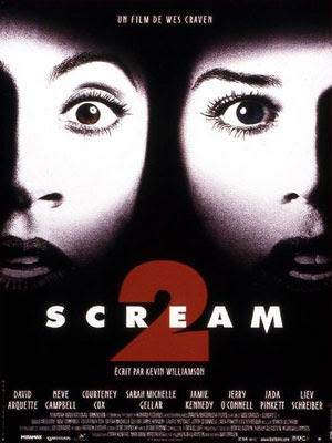
The film Poster for ‘Scream Two’ sticks to the codes and conventions of a typical film poster as it has one main title, this title tells the audience the name of the film, the title on this poster is in bold, capital letters, this makes the audience be able to know what the film poster is advertising from far away. The font isn’t very interesting but really stands out on the black background.

The actors’ names are also on the film poster like with other typical film posters, this tells the audience who shall be in the film. This is good advertisement, as people who like the actors in the film would go to see it purely for fan based purposes. The writing underneath where it has the actors’ names tells the audience about the film company and the directors and producers etc and other information that may interest the audience.

The font used for the actors’ names is similar to the font used for the title this makes a good link and looks good on the poster; the colour of the font matches both the main title and the main picture this works well and creates a nice colour schemed poster.

The main picture doesn’t give any of the film plot away it just shows to shocked faces, this makes the audience think that the film genre may be a scary one, like a thriller or horror genre, this also links with the title for the film and works well on the poster.

From looking at this poster I am able to think about colour used for the font and the type of font used. This will help me when making my poster for my film teaser trailer.


Thursday, October 22, 2009

Titles for Film Researching

http://en.wikipedia.org/wiki/Touchstone_pictures

Originally I was going to open my film with a Touchstone Pictures title but as Touchstone Pictures work under the company of Disney most films are not very explicit. Here are a few of the know films that Touchstone Pictures company have made Pretty Woman, Dead Poets Society, Sister Act, The Insider, Ernest Goes to Camp, Who Framed Roger Rabbit, Rushmore, The Royal Tenenbaums, and Good Morning Vietnam. These films mostly are aimed towards a younger audience, this means that for my film the Touchstone Pictures Title would not be used as it dosent tend to make the film genre type that my film trailer is, my film is also aimed to the older age group of people.

http://en.wikipedia.org/wiki/Universal_Studios_Home_Entertainment

A more suitable film company title opening for my film would be Universal Studios as Universal Studios Film company tends to make more adult/explicit films etc. For example the film 'The Fourth Kind' etc.

http://www.universalpictures.com/

How I made the soundtrack for the trailer

To make the soundtrack for my film teaser trailer I used a program called GarageBand on an Apple MacBook laptop. Below is a series of images which I screen shot to show what I did and how I made my soundtrack for my thriller teaser trailer.


The first thing I did was make a new project on Garageband, I did this by selecting file then new project, I then I added a new track by selecting track, then new track. By selecting this I then had the option of what type of instrument I wanted to use for the track.


I chose strings and then chose the type of strings to be Orchestral Strings; I found this sound after looking for a while through the instrument section. I chose it because it sounded the spookiest and it would suit my trailer the best.

I then used the keyboard to make my own tune for my trailer with the orchestral strings instruments. I made the buttons of my laptop correspond to the keyboard on the laptop playing the tune.

I then recorded the tune on to Garageband, the tune I made had to go with the trailer so I used the layout trailer video I had made and played the video on QuickTime Player to watch whilst recording the tune/soundtrack.
All I had to do to record the track was press the record button; the picture above shows what the button looks like. When you are recording the dark red record button lights up and becomes a brighter red colour.

On the keyboard you are able to change the pitchbend, modulation, octave and velocity levels.

After I had made the track, I changed the levels on the volume to make it prefect for the soundtrack for my trailer, I was also able to change the side from left or right for the sound on the speaker/sound system.


Once I had made the tune for the soundtrack I pressed file and then went down to ‘Export to iTunes’ and after I chose the quality of the track and then, clicked export. After this it was in iTunes ready to be added to the film trailer.


After it had been imported into iTunes I was able to place the audio track at the playhead in the video editing program- iMovie HD. Then move it to be where I wanted it to start playing in the video/trailer etc.

How I made the film

The video below explains how I made the titles for my film using the program Adobe After Effects. Please watch the full video for a full explanation of how I made the titles for my film.


This video below explains how I made my film using the program iMovie on an Apple Mac computer, it shows the processes that I used to make it. Please watch the full video for a full understanding.