
Monday, November 9, 2009
POSTER PLANNING
My idea for my poster is to have one of the main characters from the trailer in the center of the poster. This would be the main image, it would be a picture of the person with a blank face and disturbing looking drugged up eyes, this would be done by editing the image using photoshop on an Apple Mac Computer and Macbook. The face would be half be in the dark and half in the light. This would look interesting as you could only see one side of his face and would not be able to tell who exactly it is.
The side of the face in the light will be cover in blood (fake), I will have to think about the mise-en-scene for the picture as I would like the person to look as if he has been attacked, this would be done by the use of make-up etc, I like it to look very graphic. This will show the audience that the film contains strong bloody violence and give them idea of the genre,thisd will be backed up by the sign saying the film is rated 18+.
My poster shall stick to the codes and conventions of the typical poster, my research from looking at other film posters will help me decided on the layout of the image and fonts.
At the top of the poster it will have a few of the main actors names,this will tell the audience who shall be in the film and give them something to look forward to. It shall also include the title at the bottom of the poster 'Bloodshed' this title gives the audience a feel for genre as it sounds quite graphic itself as it includes something not very nice and rather disturbing 'blood'. Underneath the film title it shall have some small font text saying other things to do with the film like who made the film and produced it and created the music etc. This will tell the audience other things they may want to know.I shall also include the release date for the film at the very bottom of the poster and may include a film slogan.
As the film is a thriller genre the colours used on the poster shall be rather dark and suit the image, I may even think about a colour scheme using colours like red and black and white etc.
Poster Target Audience
1. Gender-male/female-
My film Poster will be made for both males and females to view. The poster will not be aimed directly at either sex, but most likely men would prefer to look at it as it most likely gory and very graphic, although some women also find that pictures/posters that are graphic are interesting to look at as they don’t see that sort of thing every day.
The genre for my poster shall be Thriller/Horror like with the genre for the film teaser trailer itself. The film poster may include violence and be rather graphic; this means it may include a lot of blood and guts. I would like my audience to look at the poster and some what feel a little bit sick to the stomach and may feel scared, creeped out or mystified.
Age-the age group e.g. elderly, teenagers etc-
My film poster will be aimed towards older children-adults aged 15-18 or older. This is because it may include a mild use of violence or explicit violence and may use a very graphic picture which younger children would not like. The poster would be put in areas around cinemas and in places where young adults tend to go, this would be good advertisement for the film but also would be good as younger people who may not like the look of the poster will not go to such places. Although I couldn’t make it to, to bad as people will refuse to advertise it for me, putting it up and the public may complain about it.
Class-ABC1, C2DE, lower, higher etc-
I would like my film to be for anyone from any class who like to watch thriller/action genre films.
Tuesday, November 3, 2009
Poster Research-'Saw IV'
The film poster for ‘Saw IV’ uses the codes and conventions of the typical film poster, it has the main title, which tells the audience what film the poster is advertising and has one main picture. It doesn’t have the actors names in a large font and it doesn’t standout, but it does use a slogan for the film saying “it’s a trap” this gives the audience a feeling for what could happen in the plot of the film.
The main picture is very strange and look rather creepy and a bit scary, this makes the audience think that the plot for the film shall also be scary and creepy, this makes them think about the genre for the film, they would most likely think the film is a thriller or horror genre film as the picture on the poster is pretty disturbing.
This poster also tells the audience the release date for the film; this is good, as people would start to look forward to the film coming out. Below the slogan it tells the people looking at the poster other information they may want to know about the film like who the director is and who produced the film etc.
This poster also uses a colour scheme of black, white and red, all three colours have semiotics that represent different things, red could be blood or evil, black could be bad or nasty or danger, white could be mysterious and strange etc, all of this links with the film genre being thriller or horror.
From looking at this poster it has made me think about using a slogan and more about colour scheme and how I should use semiotics and colours to represent things and to show genre for the film. It has also made me think about putting the release date on the poster to tell the audience when the film is coming out.

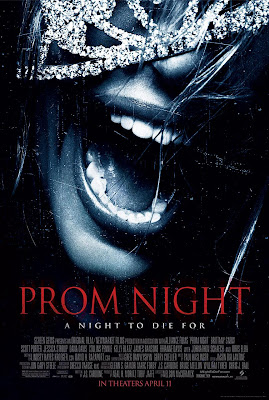
Poster Research-'Prom Night'
The poster for the film ‘Prom Night’ also uses the codes and conventions for the typical poster. It has one main picture with one main title. It also uses a slogan, has writing that tells the audience when the film shall be coming out and includes other information about the producers etc.
The poster shows just the mouth of a person screaming this is good, as it doesn’t show the audience who it is and it doesn’t give away too much, but makes the audience presume that the film may be scary and be a thriller or horror genre film.
It also uses a colour scheme which gives the dark, scary, thriller feeling such as black and red with a little bit of white. Which uses semiotics with colours representing different things like the red could be blood, making the audience think that there could be blood in the film etc.
From looking at this poster it has made think about where about I showed put the title on the poster, because on the ‘Saw IV’ poster it has it in the middle whereas on the other posters the title is at the bottom of it.

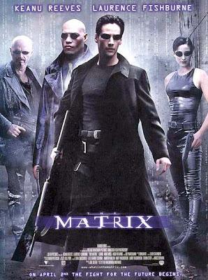
Poster Research-'The Matrix'
The Poster for “The Matrix” uses the codes and conventions for a typical film poster, it gives the audience the name/title of the film and it shows some of the main characters.
Having the image be of some of the main characters is good as it brings the audience in from look alone. It also links with the writing for the names of the actors who play these characters and who are in the film. Making the fans of these actors want to see the film purely because they are a fan.
At the bottom of the film poster it has writing saying about the film release date but also has a catch phrase/slogan after it, it says ‘on April 2nd the fight for the future begins.’ This tells the audience when the film is going to be released and what to look forward to.
From looking at this poster it has made me think about which characters from my film I need to include in my poster image and how I can link that with the font of the actors names.

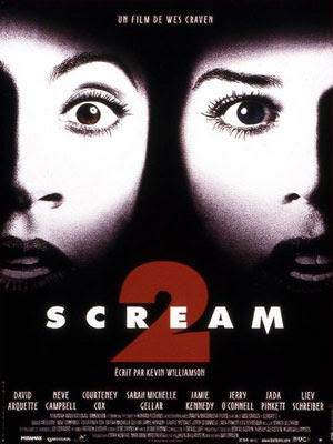
Poster Research-'Scream 2'
The film Poster for ‘Scream Two’ sticks to the codes and conventions of a typical film poster as it has one main title, this title tells the audience the name of the film, the title on this poster is in bold, capital letters, this makes the audience be able to know what the film poster is advertising from far away. The font isn’t very interesting but really stands out on the black background.
The actors’ names are also on the film poster like with other typical film posters, this tells the audience who shall be in the film. This is good advertisement, as people who like the actors in the film would go to see it purely for fan based purposes. The writing underneath where it has the actors’ names tells the audience about the film company and the directors and producers etc and other information that may interest the audience.
The font used for the actors’ names is similar to the font used for the title this makes a good link and looks good on the poster; the colour of the font matches both the main title and the main picture this works well and creates a nice colour schemed poster.
The main picture doesn’t give any of the film plot away it just shows to shocked faces, this makes the audience think that the film genre may be a scary one, like a thriller or horror genre, this also links with the title for the film and works well on the poster.
From looking at this poster I am able to think about colour used for the font and the type of font used. This will help me when making my poster for my film teaser trailer.
Subscribe to:
Comments (Atom)
