Friday, November 13, 2009
HOW I MADE THE POSTER
The Poster was made on an Apple Mac Computer, It was edited using the program Photoshop. The photos used were my own and taken on a digital camera, please watch the full video above to understand fully how I made the video.

THE FINAL POSTER
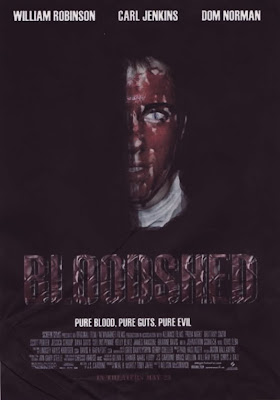
Below is my final product of the poster which I made and edited from feedback. I followed the codes and conventions and took my own photos and made everthing on the poster myself. Please click on the image below to enlarge and get a better look.
 Also from other feedback I was told that the gradient in the background took away from the main image and didnt look as good, so had to be changed back.
 I also tried adding a gradient to the background to get rid of more of the black. From feedback I was told that my new coloured text wasnt as good as the other text as it didnt match up to the blood coloured face on the poster.
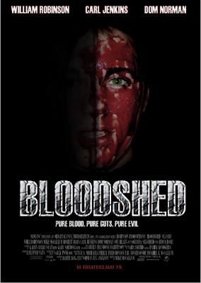 I decided that the main title font on the poster didnt satndout enough so I changed the effect and colours for the title to see what it looked like and to get feedback on it. I also enlarged the main image to get rid of more of the black background.
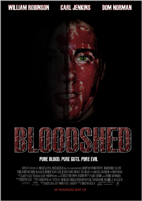 To get rid of these problems I changed the staturation/hue levels of the image and the brightness levels for the image, this made it look less like soup. I also changed the font of the date realease line to make it stand out more. I also made the actors names stand out more by adding a red stroke line around the edge of the font. I also made the eye standout more by cutting around the edge of the eye in the image and seperated from the picture using the lasso tool and then changed the staturation/hue levels and brightness levels to make it look better.
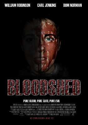 From feedback from friends, family, random people and teachers, I was told that the image aboves main picture looked strange as the blood on the persons face in the image looked more like soup than blood, this I had to change. I was also told that the background behind the image had to much black showing. I was also told that the date release line was to easy to see. Both of these things had to be changed.
 Also from other feedback I was told that the gradient in the background took away from the main image and didnt look as good, so had to be changed back.
 I also tried adding a gradient to the background to get rid of more of the black. From feedback I was told that my new coloured text wasnt as good as the other text as it didnt match up to the blood coloured face on the poster.
 I decided that the main title font on the poster didnt satndout enough so I changed the effect and colours for the title to see what it looked like and to get feedback on it. I also enlarged the main image to get rid of more of the black background.
 To get rid of these problems I changed the staturation/hue levels of the image and the brightness levels for the image, this made it look less like soup. I also changed the font of the date realease line to make it stand out more. I also made the actors names stand out more by adding a red stroke line around the edge of the font. I also made the eye standout more by cutting around the edge of the eye in the image and seperated from the picture using the lasso tool and then changed the staturation/hue levels and brightness levels to make it look better.
 From feedback from friends, family, random people and teachers, I was told that the image aboves main picture looked strange as the blood on the persons face in the image looked more like soup than blood, this I had to change. I was also told that the background behind the image had to much black showing. I was also told that the date release line was to easy to see. Both of these things had to be changed.
Monday, November 9, 2009
NEAR FINISHED POSTER
This is my final poster, I made it using Photoshop on an Apple Macbook laptop. I also took the photo used using my Casio digital camera , edited and made it look good quality and fit in on the poster using various techniques. I made the text using Photoshop and using different techniques and then layed it all out to look like a good film poster for my film trailer. When people look at the poster they will be able to tell that the film genre isnt very nice and is most likely a horror or thriller film genre, this is done because of the blood on the persons face. The poster includes actors names, a slogan, the date the film shall be realeased and other information.

PRE-POSTER
This poster shows my layout and text design, but is not final, I shall be taken some of my own photographs using a Casio Digitial Camera and not just using a frame shot from the film as it looks bad quality and could look a lot better, I shall make it look like the drawing or similiar to the drawing on my poster plan post previously.


POSTER PLANNING
My idea for my poster is to have one of the main characters from the trailer in the center of the poster. This would be the main image, it would be a picture of the person with a blank face and disturbing looking drugged up eyes, this would be done by editing the image using photoshop on an Apple Mac Computer and Macbook. The face would be half be in the dark and half in the light. This would look interesting as you could only see one side of his face and would not be able to tell who exactly it is.
The side of the face in the light will be cover in blood (fake), I will have to think about the mise-en-scene for the picture as I would like the person to look as if he has been attacked, this would be done by the use of make-up etc, I like it to look very graphic. This will show the audience that the film contains strong bloody violence and give them idea of the genre,thisd will be backed up by the sign saying the film is rated 18+.
My poster shall stick to the codes and conventions of the typical poster, my research from looking at other film posters will help me decided on the layout of the image and fonts.
At the top of the poster it will have a few of the main actors names,this will tell the audience who shall be in the film and give them something to look forward to. It shall also include the title at the bottom of the poster 'Bloodshed' this title gives the audience a feel for genre as it sounds quite graphic itself as it includes something not very nice and rather disturbing 'blood'. Underneath the film title it shall have some small font text saying other things to do with the film like who made the film and produced it and created the music etc. This will tell the audience other things they may want to know.I shall also include the release date for the film at the very bottom of the poster and may include a film slogan.
As the film is a thriller genre the colours used on the poster shall be rather dark and suit the image, I may even think about a colour scheme using colours like red and black and white etc.
The side of the face in the light will be cover in blood (fake), I will have to think about the mise-en-scene for the picture as I would like the person to look as if he has been attacked, this would be done by the use of make-up etc, I like it to look very graphic. This will show the audience that the film contains strong bloody violence and give them idea of the genre,thisd will be backed up by the sign saying the film is rated 18+.
My poster shall stick to the codes and conventions of the typical poster, my research from looking at other film posters will help me decided on the layout of the image and fonts.
At the top of the poster it will have a few of the main actors names,this will tell the audience who shall be in the film and give them something to look forward to. It shall also include the title at the bottom of the poster 'Bloodshed' this title gives the audience a feel for genre as it sounds quite graphic itself as it includes something not very nice and rather disturbing 'blood'. Underneath the film title it shall have some small font text saying other things to do with the film like who made the film and produced it and created the music etc. This will tell the audience other things they may want to know.I shall also include the release date for the film at the very bottom of the poster and may include a film slogan.
As the film is a thriller genre the colours used on the poster shall be rather dark and suit the image, I may even think about a colour scheme using colours like red and black and white etc.
Poster Target Audience
1. Gender-male/female-
My film Poster will be made for both males and females to view. The poster will not be aimed directly at either sex, but most likely men would prefer to look at it as it most likely gory and very graphic, although some women also find that pictures/posters that are graphic are interesting to look at as they don’t see that sort of thing every day.
The genre for my poster shall be Thriller/Horror like with the genre for the film teaser trailer itself. The film poster may include violence and be rather graphic; this means it may include a lot of blood and guts. I would like my audience to look at the poster and some what feel a little bit sick to the stomach and may feel scared, creeped out or mystified.
Age-the age group e.g. elderly, teenagers etc-
My film poster will be aimed towards older children-adults aged 15-18 or older. This is because it may include a mild use of violence or explicit violence and may use a very graphic picture which younger children would not like. The poster would be put in areas around cinemas and in places where young adults tend to go, this would be good advertisement for the film but also would be good as younger people who may not like the look of the poster will not go to such places. Although I couldn’t make it to, to bad as people will refuse to advertise it for me, putting it up and the public may complain about it.
Class-ABC1, C2DE, lower, higher etc-
I would like my film to be for anyone from any class who like to watch thriller/action genre films.

My film Poster will be made for both males and females to view. The poster will not be aimed directly at either sex, but most likely men would prefer to look at it as it most likely gory and very graphic, although some women also find that pictures/posters that are graphic are interesting to look at as they don’t see that sort of thing every day.
The genre for my poster shall be Thriller/Horror like with the genre for the film teaser trailer itself. The film poster may include violence and be rather graphic; this means it may include a lot of blood and guts. I would like my audience to look at the poster and some what feel a little bit sick to the stomach and may feel scared, creeped out or mystified.
Age-the age group e.g. elderly, teenagers etc-
My film poster will be aimed towards older children-adults aged 15-18 or older. This is because it may include a mild use of violence or explicit violence and may use a very graphic picture which younger children would not like. The poster would be put in areas around cinemas and in places where young adults tend to go, this would be good advertisement for the film but also would be good as younger people who may not like the look of the poster will not go to such places. Although I couldn’t make it to, to bad as people will refuse to advertise it for me, putting it up and the public may complain about it.
Class-ABC1, C2DE, lower, higher etc-
I would like my film to be for anyone from any class who like to watch thriller/action genre films.
Subscribe to:
Posts (Atom)