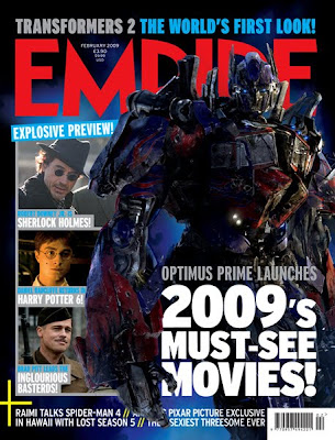
This magazine front cover has a lot going on, it looks really interesting and looks as if it is jam packed with fun and appealing information.
It has one main picture and three separate other pictures of interest to its audience. Under the other three pictures it has titles saying what is shown in the picture, this makes them want to look inside the magazine.
The text is appealing to the audience as it says things like ‘MUST-SEE’, it then makes people want people want to buy the magazine to see what they ‘MUST-SEE’ etc.
The cover lines are at the bottom of the magazine front cover this is good as after they have read down from the top of the front cover page, it just tells them other extra stuff; just encase its something they’d like.
It also has the cost of the magazine written next to the date-line; this is good as people are able to see if it is a new or old issue and how much it shall cost them to buy etc.
From looking at this magazine front cover I have thought about using extra separate pictures as well as the main picture, I have also thought about ways to make my magazine front cover look more jam packed and interesting. I have also thought about where the date-line and cost should be written etc.


No comments:
Post a Comment