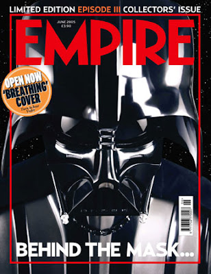
The first thing that captures the attention of the audience/ the person viewing the magazine is the writing at the top of the page saying ‘Limited Edition…’ this makes it seem more important and would make people want it as it is limited etc.
The white writing/font at the top of the page looks good as it stands out against the black background of the helmet of the main picture, but the white writing at the bottom of the film magazine front cover is ruined as it goes of the white of the main picture, this makes you not as able to see the writing saying ‘behind the mask’.
It doesn’t use many cover lines at all telling people what is in the magazine, there is only some very important ones.
The magazine front cover also uses a boarder; the boarder also matches colours with the masterhead this looks good as there is a nice link in the colour scheme. The magazine front cover like the others also uses a barcode.
From looking at this magazine front cover it has reminded me that I will need to have a barcode on my front cover, it also has made me think about using a boarder around my main picture etc.


No comments:
Post a Comment