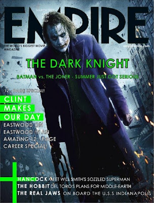
The main picture over laps but also goes underneath the masterhead, this looks interesting as the background to the picture is in the background of the text and the person is more up front standing in front of the text/ masterhead.This looks really effective, even though people cant see the full masterhead they know it says ‘Empire’ as it is a well known magazine brand company.
The colours used look good as they are bright and look more interesting, they standout more and capture peoples attention better. The purple coat and the green writing etc looks good as they are like opposites and looks good all as one.
It has a date line at the top of the film magazine cover just over the top of the picture and over the top of the masterhead title. It also has a main cover line saying ‘The Dark Knight’ this tells the audience what the main thing to see is in the magazine. It also has other text saying the cover lines; this also tells the audience what to look forward to in the magazine.
From looking at this magazine I have been able to think more bout the main cover line and other cover lines, they have to be interesting and eye capturing to make people want to buy the magazine etc. I also like the layering of the main picture behind and in front of the text.


No comments:
Post a Comment