Tuesday, November 17, 2009
HOW I MADE THE MAGAZINE
To make my film magazine front cover I used my own photos which I had taken using a Casio digital camera, I then uploaded them on to an Apple Mac Computer and edited them using Photoshop, below is a video to explain this process and how I did it. Please watch the full video to understand my work process.
Film Mag Plan
Both of these images are planned drawing of what the layout shall look like for my film magazine front cover. I shall take my own photos and make my own texts using a camera and an editing program on an Apple Mac Computer called Photoshop. This shall be made in the same way as I made my film poster.


Film Magazine Front Cover Target Audience
Gender-male/female-
My film magazine front cover will be made for both males and females to view. The film magazine front cover shall stick to the codes and conventions of a typical magazine front cover. The film magazine front cover shall not be aimed directly at either sex. Although men would most likely prefer to look at it as it most likely to have a gory and very graphic picture some where on the cover as the film it shall be advertising is my horror trailer film ‘Bloodshed’. Even though some women also find that pictures are interesting to look at as they don’t see that sort of thing every day, even it doesn’t look very nice.
The genre for my film magazine front cover shall be Thriller/Horror like with the genre for the film teaser trailer and film poster. The film magazine cover may include violence and be rather graphic with the pictures. It shall have one main big masterhead (magazine title, a date of the issue line, a main cover line (main topic with in the magazine to grab attention of people), model credit (use of a famous person or character), a main image, cover lines (other things that the magazine speaks about).
I would like my audience to look at the film magazine and think it looks interesting and would make them want to buy it if it were a real product in a shop. My Magazine front cover shall stick to the codes and conventions of the typical film magazine front cover.
Age-the age group e.g. elderly, teenagers etc-
My film magazine front cover will be aimed towards older children/adults aged 15-18 or older. This is because it may include a mild use of violence or explicit materials within the magazine and may use a graphic picture on the front cover which younger children would not like.
The magazine would be put in shops and sometimes in cinemas and in places where young adults tend to look for there magazines, so this would most likely be with other magazine of the same type such as ‘Empire’, ‘NME’, ‘FHM’ etc. This would give the magazine a good advertisement for the audience, as they would know where to look for it.
Class-ABC1, C2DE, lower, higher etc-
I would like my film magazine to be for any class, so anyone who just generally like films and knowing more about them.
Monday, November 16, 2009
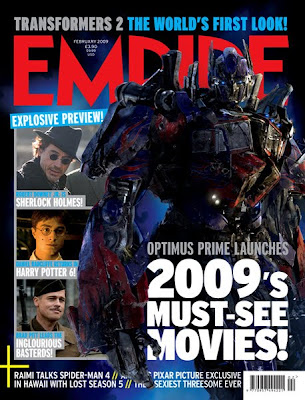
Research Film Mag Front Cover- Transformers 2
This film magazine front cover also sticks to the codes and conventions of the typical magazine front cover, using one main big masterhead (magazine title) saying Empire, a date of the issue line, a main cover line (main topic with in the magazine to grab attention of people), model credit (use of a famous person or character), a main image, cover lines (other things that the magazine speaks about).
This magazine front cover has a lot going on, it looks really interesting and looks as if it is jam packed with fun and appealing information.
It has one main picture and three separate other pictures of interest to its audience. Under the other three pictures it has titles saying what is shown in the picture, this makes them want to look inside the magazine.
The text is appealing to the audience as it says things like ‘MUST-SEE’, it then makes people want people want to buy the magazine to see what they ‘MUST-SEE’ etc.
The cover lines are at the bottom of the magazine front cover this is good as after they have read down from the top of the front cover page, it just tells them other extra stuff; just encase its something they’d like.
It also has the cost of the magazine written next to the date-line; this is good as people are able to see if it is a new or old issue and how much it shall cost them to buy etc.
From looking at this magazine front cover I have thought about using extra separate pictures as well as the main picture, I have also thought about ways to make my magazine front cover look more jam packed and interesting. I have also thought about where the date-line and cost should be written etc.
Research Mag Front Cover- Star Wars
This film magazine front cover also sticks to the codes and conventions of the typical magazine front cover, using one main big masterhead (magazine title) saying Empire, a date of the issue line, a main cover line (main topic with in the magazine to grab attention of people), model credit (use of a famous person or character), a main image, cover lines (other things that the magazine speaks about).
The first thing that captures the attention of the audience/ the person viewing the magazine is the writing at the top of the page saying ‘Limited Edition…’ this makes it seem more important and would make people want it as it is limited etc.
The white writing/font at the top of the page looks good as it stands out against the black background of the helmet of the main picture, but the white writing at the bottom of the film magazine front cover is ruined as it goes of the white of the main picture, this makes you not as able to see the writing saying ‘behind the mask’.
It doesn’t use many cover lines at all telling people what is in the magazine, there is only some very important ones.
The magazine front cover also uses a boarder; the boarder also matches colours with the masterhead this looks good as there is a nice link in the colour scheme. The magazine front cover like the others also uses a barcode. 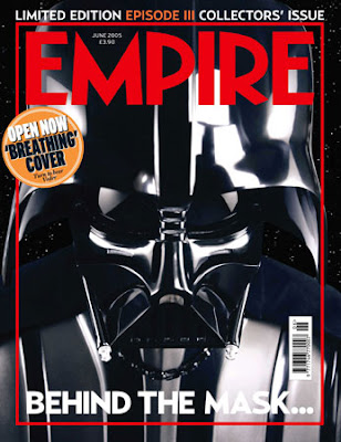
The first thing that captures the attention of the audience/ the person viewing the magazine is the writing at the top of the page saying ‘Limited Edition…’ this makes it seem more important and would make people want it as it is limited etc.
The white writing/font at the top of the page looks good as it stands out against the black background of the helmet of the main picture, but the white writing at the bottom of the film magazine front cover is ruined as it goes of the white of the main picture, this makes you not as able to see the writing saying ‘behind the mask’.
It doesn’t use many cover lines at all telling people what is in the magazine, there is only some very important ones.
The magazine front cover also uses a boarder; the boarder also matches colours with the masterhead this looks good as there is a nice link in the colour scheme. The magazine front cover like the others also uses a barcode.
From looking at this magazine front cover it has reminded me that I will need to have a barcode on my front cover, it also has made me think about using a boarder around my main picture etc.
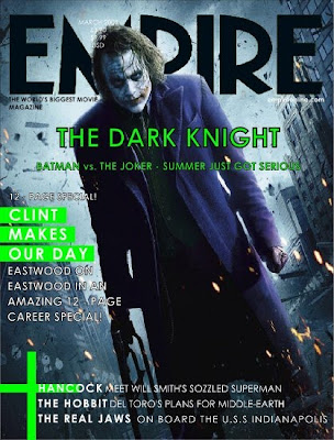
Research Mag Film Front Cover- The Dark Knight
This film magazine front cover also sticks to the codes and conventions of the typical magazine front cover, using one main big masterhead (magazine title) saying Empire, a date of the issue line, a main cover line (main topic with in the magazine to grab attention of people), model credit (use of a famous person), a main image, cover lines (other things that the magazine speaks about).
The main picture over laps but also goes underneath the masterhead, this looks interesting as the background to the picture is in the background of the text and the person is more up front standing in front of the text/ masterhead.This looks really effective, even though people cant see the full masterhead they know it says ‘Empire’ as it is a well known magazine brand company.
The colours used look good as they are bright and look more interesting, they standout more and capture peoples attention better. The purple coat and the green writing etc looks good as they are like opposites and looks good all as one.
It has a date line at the top of the film magazine cover just over the top of the picture and over the top of the masterhead title. It also has a main cover line saying ‘The Dark Knight’ this tells the audience what the main thing to see is in the magazine. It also has other text saying the cover lines; this also tells the audience what to look forward to in the magazine.
From looking at this magazine I have been able to think more bout the main cover line and other cover lines, they have to be interesting and eye capturing to make people want to buy the magazine etc. I also like the layering of the main picture behind and in front of the text.
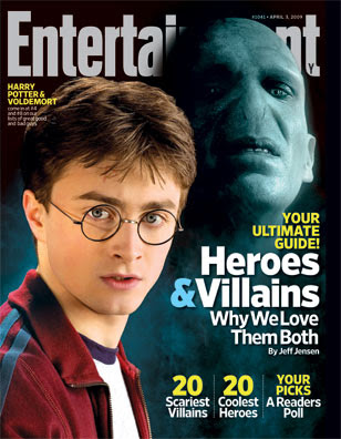
Research Film Mag Front Cover- Harry Potter
The film magazine front cover sticks to the codes and conventions of the typical magazine front cover, using one main big masterhead (magazine title), a date of the issue line, a main cover line (main topic with in the magazine to grab attention of people), model credit (use of a famous person), a main image, cover lines (other things that the magazine speaks about).
This film magazine front cover uses a nice colour scheme, making the picture really stand out. The colours used bounce of each and stand out making the text and picture look clear. The whites in the fonts go well with the pale face and white shirt of Harry Potter and the yellows bring out the main parts of the text which they want to tell there audience as it is more vibrant. The blue and sign links well with the blue mist and the bluey grey face of Voldemort.
The Picture of Voldemort has been edited well into to the background behind Harry Potter this looks good as it makes him look further away, more mysterious and shows he is the Villain out of the two.
The Main picture with Voldemort over lays the main title/masterhead; this looks good and makes it look more interesting. It also shows that the magazine must be well know anyway, even if they did cover up half the text in the main title people would still be able to known which magazine it is.
The cover lines tell the audience what to look forward to in the magazine and they make sure they write about interesting things that could grab there attention. Like a heroes and villains section etc.
From looking at this magazine front cover I have been able to understand layout and colour scheme for the typical magazine.
Subscribe to:
Comments (Atom)
