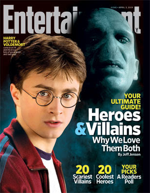
This film magazine front cover uses a nice colour scheme, making the picture really stand out. The colours used bounce of each and stand out making the text and picture look clear. The whites in the fonts go well with the pale face and white shirt of Harry Potter and the yellows bring out the main parts of the text which they want to tell there audience as it is more vibrant. The blue and sign links well with the blue mist and the bluey grey face of Voldemort.
The Picture of Voldemort has been edited well into to the background behind Harry Potter this looks good as it makes him look further away, more mysterious and shows he is the Villain out of the two.
The Main picture with Voldemort over lays the main title/masterhead; this looks good and makes it look more interesting. It also shows that the magazine must be well know anyway, even if they did cover up half the text in the main title people would still be able to known which magazine it is.
The cover lines tell the audience what to look forward to in the magazine and they make sure they write about interesting things that could grab there attention. Like a heroes and villains section etc.
From looking at this magazine front cover I have been able to understand layout and colour scheme for the typical magazine.

No comments:
Post a Comment