The actors’ names are also on the film poster like with other typical film posters, this tells the audience who shall be in the film. This is good advertisement, as people who like the actors in the film would go to see it purely for fan based purposes. The writing underneath where it has the actors’ names tells the audience about the film company and the directors and producers etc and other information that may interest the audience.
The font used for the actors’ names is similar to the font used for the title this makes a good link and looks good on the poster; the colour of the font matches both the main title and the main picture this works well and creates a nice colour schemed poster.
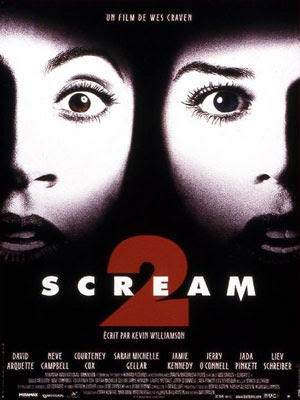
The main picture doesn’t give any of the film plot away it just shows to shocked faces, this makes the audience think that the film genre may be a scary one, like a thriller or horror genre, this also links with the title for the film and works well on the poster.
From looking at this poster I am able to think about colour used for the font and the type of font used. This will help me when making my poster for my film teaser trailer.

No comments:
Post a Comment