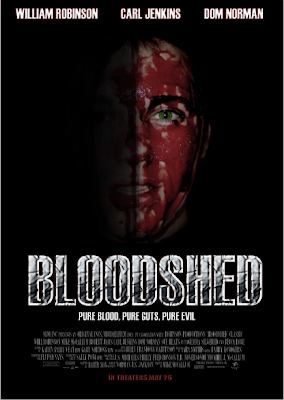
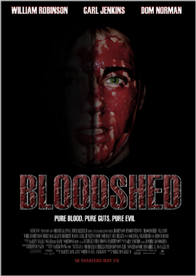
 Also from other feedback I was told that the gradient in the background took away from the main image and didnt look as good, so had to be changed back.
 I also tried adding a gradient to the background to get rid of more of the black. From feedback I was told that my new coloured text wasnt as good as the other text as it didnt match up to the blood coloured face on the poster.
 I decided that the main title font on the poster didnt satndout enough so I changed the effect and colours for the title to see what it looked like and to get feedback on it. I also enlarged the main image to get rid of more of the black background.
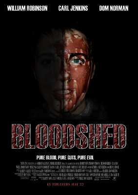
 To get rid of these problems I changed the staturation/hue levels of the image and the brightness levels for the image, this made it look less like soup. I also changed the font of the date realease line to make it stand out more. I also made the actors names stand out more by adding a red stroke line around the edge of the font. I also made the eye standout more by cutting around the edge of the eye in the image and seperated from the picture using the lasso tool and then changed the staturation/hue levels and brightness levels to make it look better.
 From feedback from friends, family, random people and teachers, I was told that the image aboves main picture looked strange as the blood on the persons face in the image looked more like soup than blood, this I had to change. I was also told that the background behind the image had to much black showing. I was also told that the date release line was to easy to see. Both of these things had to be changed.
No comments:
Post a Comment